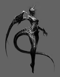
I started this doodle in the middle of the week after the first painting was getting almost done.
At this point I didn't know what exactly this character is going to be. However, I had one basic concept that I was hanging on: terrifying female creature. This is very simple and open concept that has just right amount of freedom to start working on visuals. There are couple of things I tried to nail down at this stage:
-strong silhouette, including gesture that describes the nature of the character
-the relationship between the character and viewer (the attitude of the character)
When I design character,I always start from these two. The latter is the most important because once that is decided, all the other elements can be constructed around it. In this case, the viewer should be terrified by the character. That sets the attitude of the character immediately, NOT SO FRIENDLY.
So, next question is, how can I effectively express that she is not friendly? My solution is to have her directly addressing to the viewer, but her identity remains mysterious. Her gesture suggests she is reaching toward you, screaming at you, but her eyes are invisible that you can't detect what she is thinking. This psychological trick is used a lot in horror films and video games. No eye contact triggers sense of fear.
...then I got bored. (happens pretty often, frankly speaking...) I realized this character is kind of looking like unicorn. Aww it's sooo magical. ...then I had to grab the logo off from the internet and put it for fun.
I often flip whole canvas (I set shortcut key for that) to see if the composition is well balanced. Also this is good way to detect anatomical errors. I started to develop the tummy area, and put a small person inside. Now the concept is kind of like one of the robots from anime...like evangelion...
Started to tackle the forearm anatomy, trying to make sense with the tail like silhouette. It was a struggle for a while, and I had to have something to keep going. so...Happy Mother's Day, mom<3
Working on the details of the hand/arm area, and made a decision to make the tail emerging from the hip. And something to make the piece more appropriate for censorship. I know what the deal is in real publishing world.
This is what I was using for reference to construct the anatomy of this character. Her body base is human female, combined with bat arm and tuna eye for the tummy area. Initially I was thinking putting huge eyeball on her torso. (which might have been cool, but I like the really controversial concept of her being sort of pregnant better).
I got good peer review to emphasize the silhouette more . I liked the spiky tail and hand idea, so I revised my design.
In this version I got rid of the background gradient to make sure the whole silhouette works nicely with her anatomy. I thought the figure is starting to loose the creepy fleshy weirdness, so I reverted the tail back to the original direction.
The idea is to have really gross looking worm like tail...and here's my cute gross worm reference. So cute, so gross.
After resolving the main shape issues I decided to move on to colors. I made color and hue layers as clipping mask on top of the character (the background was a separate layer), and started to dump some colors in. Then I made layers on top of everything, adding smoke effects and splatters etc...btw these are all done in brush. No texture layers. There were only 3 brush I used; main chalk like brush for blocking and details, occasional airbrush for blending, and toothlike texture brush for finishing touch.
I thought I was almost getting done, but then Donato came by and pointed out the wing hand is not working. We sat together and re-examined the bat reference, then we figured out how it should be rendered in right perspective. Below is the drawover I did to mark the joints and bones.
..and this is the finish. With my sign on it. I have never signed my digital work, because I don't believe in strict ownership of work. However, I learned here at IMC that it's the best way to get recognized by right audience.
One thing I learned this week is the importance of shape and value. Composition is the hardest and the most important thing to nail down in any kind of visuals. If it doesn't work , the image doesn't serve any purpose and therefore it ends up looking like a sketch. One way to get it right is to use shapes to express the concept/story. In this case, spiky shapes and tense posture was purposefully used to create the tension of the moment.
I also found Doug's quote really inspiring..."BE LAZY". Overworking on details actually kills the powerful presence of the subject. If the concept is clear, then the composition finds the focus, and so I know where to put the detail and where to keep it loose.
...looks like I spent a lot of time painting the breast area. mmm.


Wow! Thanks for the step by step breakdown! That was a fun read!
ReplyDeletehope this gave you creative ideas for your own project! :)
Deleteメイキングありがとうございます。とても難しかったです。そして、まだ難しい…
ReplyDelete要は根気と練習量です・・・うまい人はそれだけ努力してるってわかりました
Delete