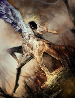
Here at Illustration Master Class, we get to talk to amazing faculties...I've been getting tons of great feedback from those masters in Illustration industry. On the first day Scott Fischer encouraged me to go for my doodle since I'm more excited about it than assignment thumbnails. Though Doug Gregory pointed out the relationship between two figure is too vague. He suggested possible story; instead of the death angel taking the life from the figure, the figure is trying to capture the angel to end her life. I was excited by the interpretation, so I made further detail incorporating the concept.
Later that day Greg Manchess, Dan Dos Santos, and Donato Giancola showed how important it is to have reference for a painting. I have never done such an intense reference photo shooting with models for my painting. I always vaguely knew I have to do more research to gather reference materials, but after seeing their process it became really clear how it affects the outcome if one paints only out of his head. It shows. (and it looks sad) So I tried to get accurate reference for the head...
The next day Donato came by and gave me feedback. He said I could push this further to next level by showing more conscious thought for background. Since the angel is already bizarre it would create strong contrast if the setting is more familiar than fantasy landscape. I agreed. Totally, right.
Also Boris Vallejo took a look at my progress. I asked him how to deal with color, and he said "just do whatever works for your story...there is no right nor wrong"
I tried more simple but effective background, still incorporating the dying figure trying to catch the angle. Brom stopped by and gave me a feedback it'll be better not to cut the legs of the angel.
Then I got feedback that the hands are too separated from the main angel figure, so I reworked on the posture and placement of the hands. Maybe it's too much to have a set of hands.
Dan Dos Santos did quick draw over of my piece, suggesting surreal dreamy landscape for background.
It's lovely and strong visual, but personally I'm more attached to the interior as environment concept...so it's like this currently, as of this morning. (who knows what happens to this tomorrow)


:O WOWZERS!!! Looking goood!
ReplyDeleteI wanna look this Illustration making xo
ReplyDelete